Wellthie
Product: Insurance selection tool for small businesses.
Role: Lead UX/UI
Scope: Web app
Wellthie sought to make it easy for small businesses to discover, search, compare and purchase employee benefits.
The Challenge
Small businesses are often overwhelmed by insurance purchasing: too many plans, unfamiliar terms, and fear of choosing “wrong” and spending too much.
More choice can create more anxiety, which in turn leads to drop-offs or low-confidence decisions.
The tool need to account for:
6000 insurance companies, average of 20 different structures and cost-sharing combinations, additional variations for deductibles, family coverage, out-of-pocket rates, provider selections, out of network care, etc.
Goal
How do I turn a massive insurance offerings catalog into a guided decision path that:
Helps employers reach a confident shortlist
Reduces cognitive load and uncertainty
Produces qualified, structured leads for brokers to close faster
Users
Wellthie’s key user groups include employers, employees, HR representatives, and insurance brokers. Each brings a unique perspective that helped shape the broader context of the benefits discovery tool.
Primary users: Employer-decision-maker.
They need clarity, visible guardrails and assurances, and clear goals - without being forced to become an insurance expert. Their employees are subsequent personas who are effected by their decisions.
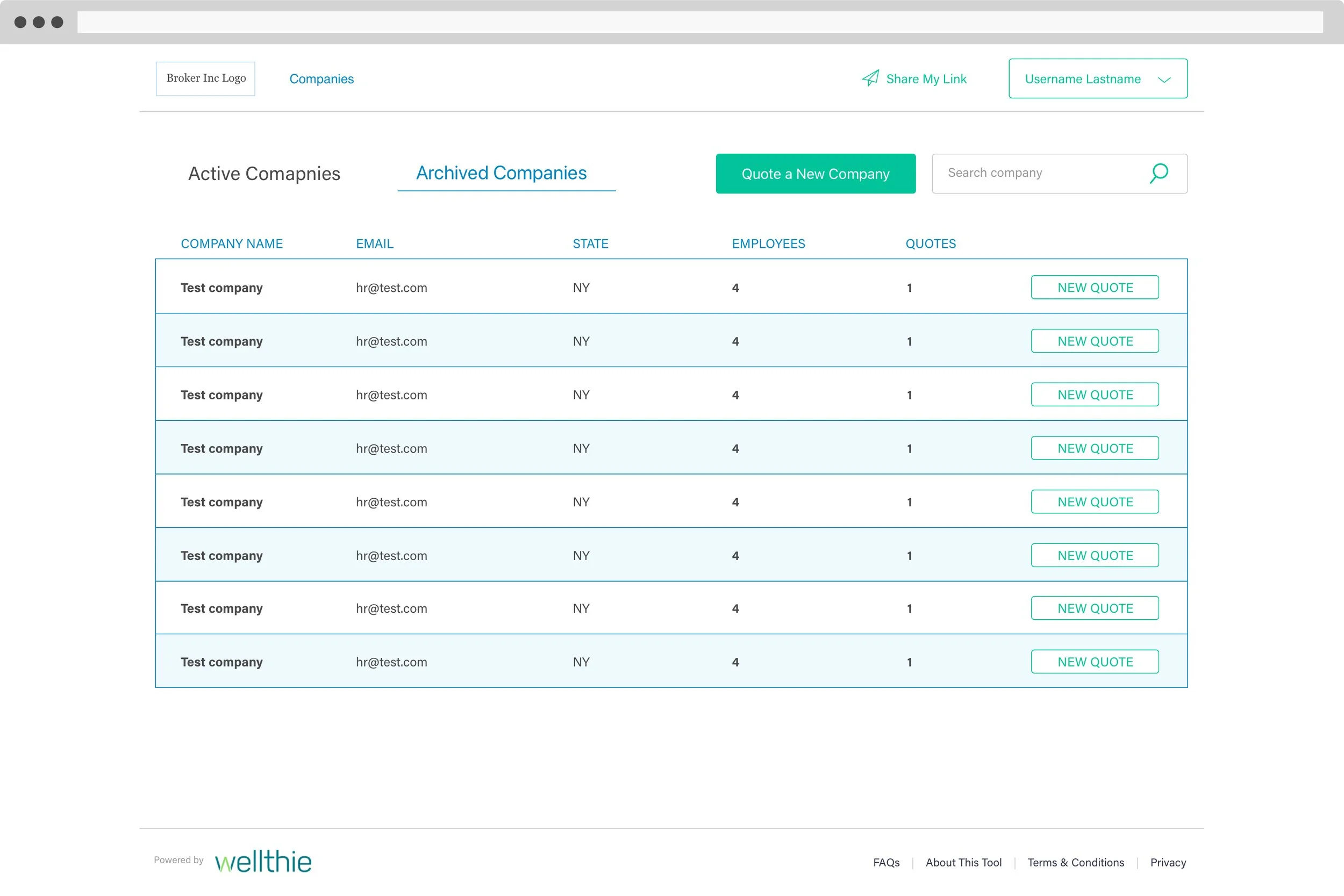
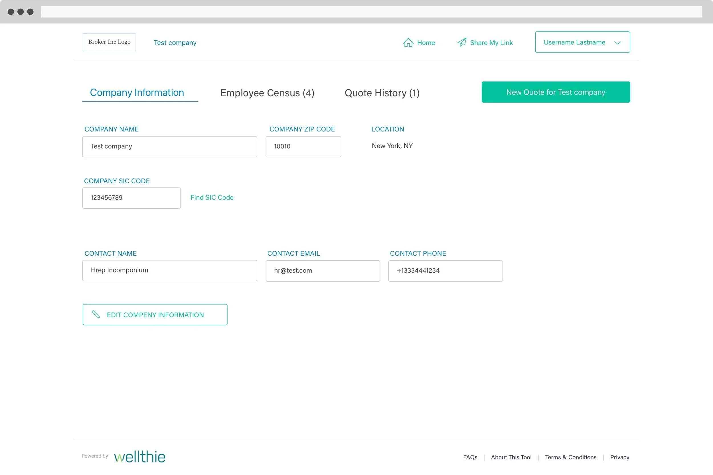
Secondary users: Independent Brokers.
The funnel is designed to simplify their work by:
Saving explanation and meeting time.
Filtering out mismatched leads.
Capturing structured input that improves plan fit and reduces back-and-forth.
Personas used for discovery
Journey map
To understand how different user types interacted with Wellthie’s platform from start to finish, I created journey maps grounded in personas, quantitative data, and marketing insights. This process helped clarify user touchpoints, refine key paths and goals, and optimize the conversion funnel. It also revealed opportunities for future features, including a dedicated Broker dashboard.
Journey map for employers and employees.
Key usability risks
Designing an insurance selection tool comes with structural UX risks that the experience needed to actively counter

Cognitive overload from insurance complexity
Jargon, dense data, and unfamiliar structures quickly exhaust users’ attention and confidence.

Decision paralysis
Too many plans and variables create anxiety and stall progress before commitment.

Premature comparison
Comparing plans before understanding their actual needs can lead users to make the wrong choice.

Loss of momentum and weak payoff
Multi-step onboarding risks fatigue if there is no progress indication or frustration at a weak/non-existent result.
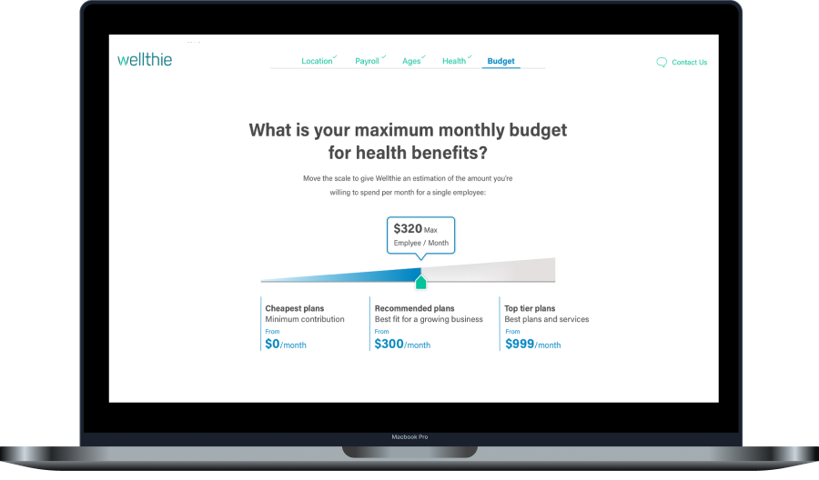
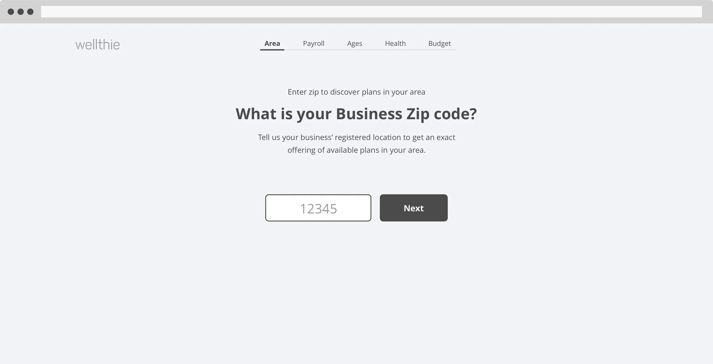
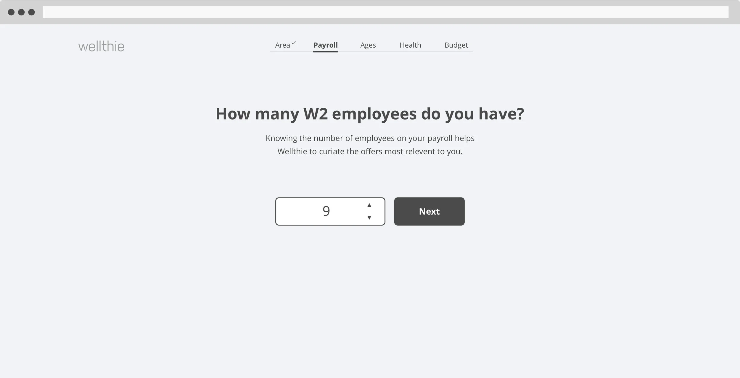
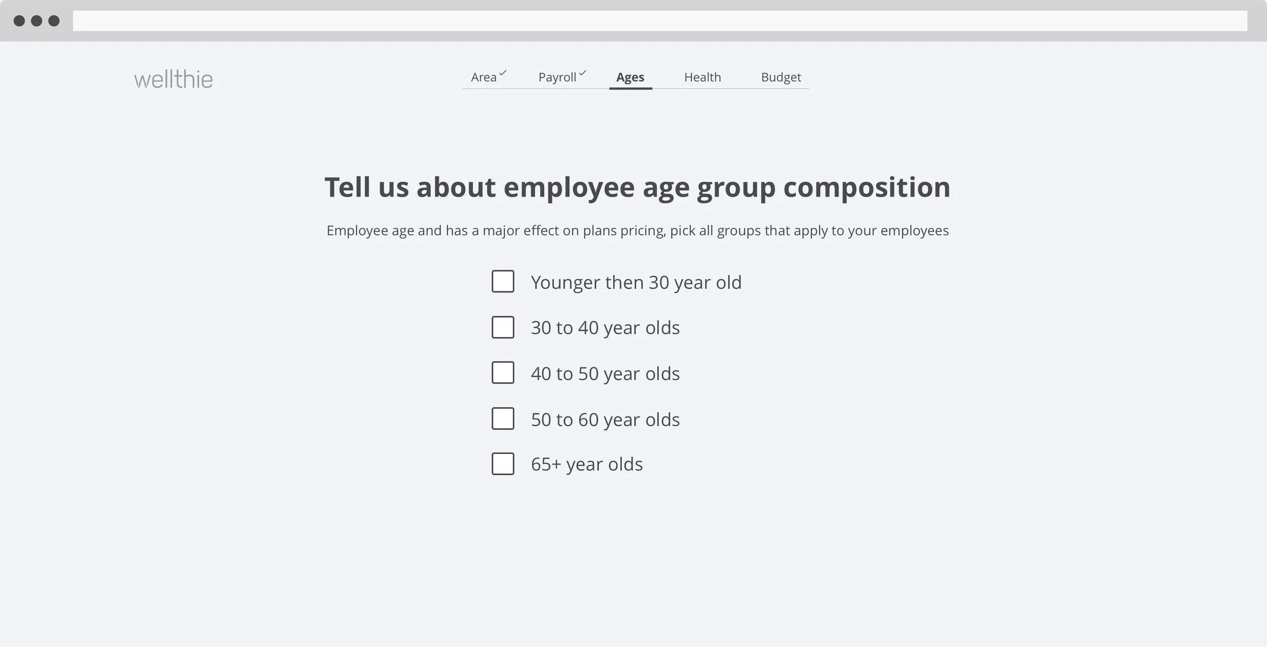
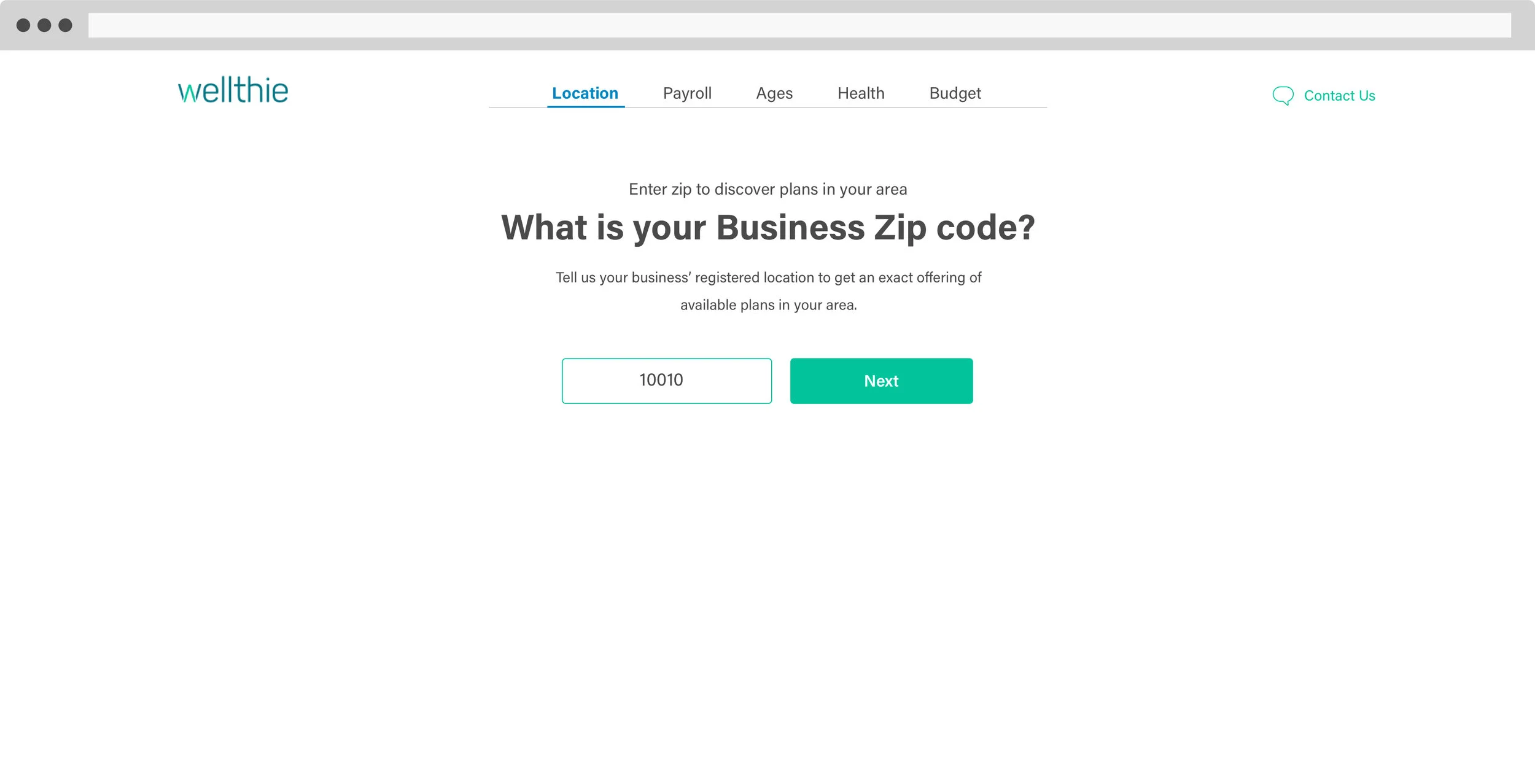
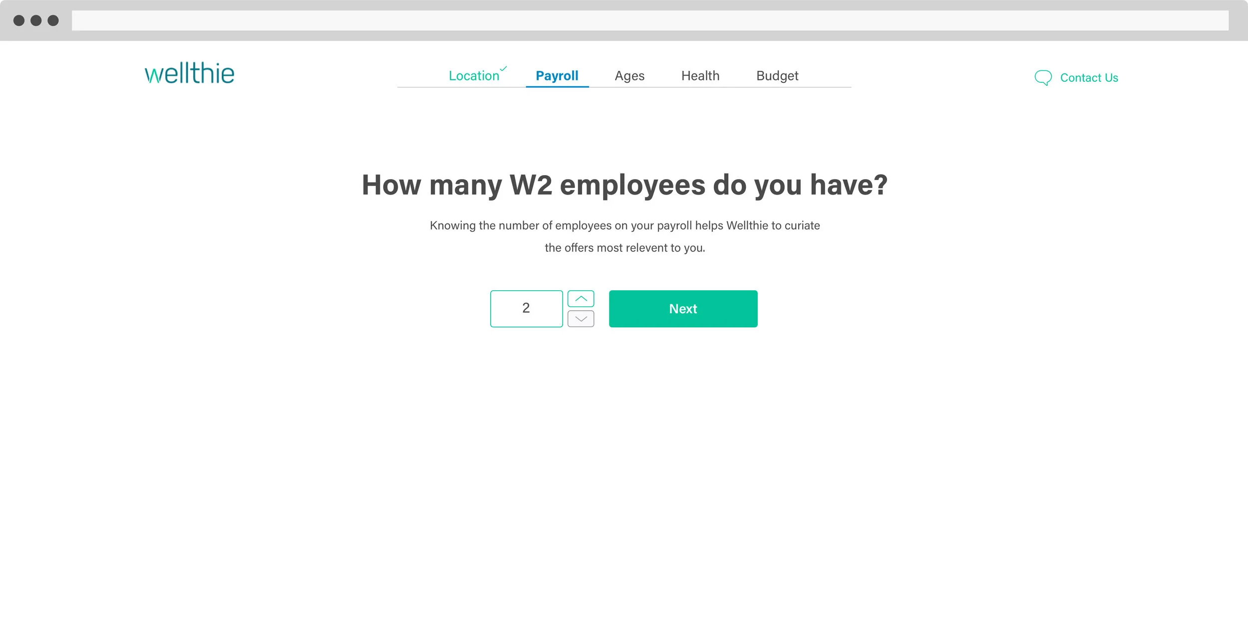
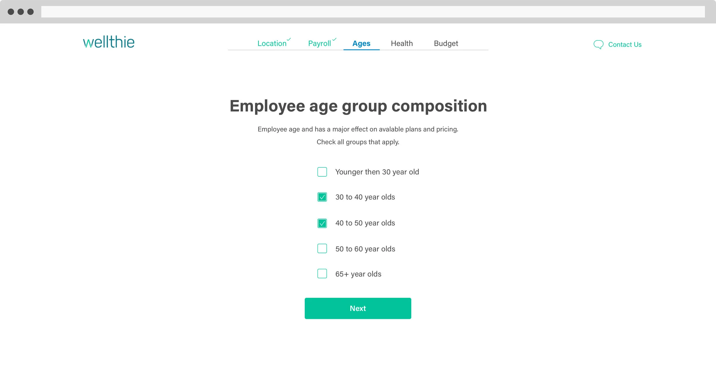
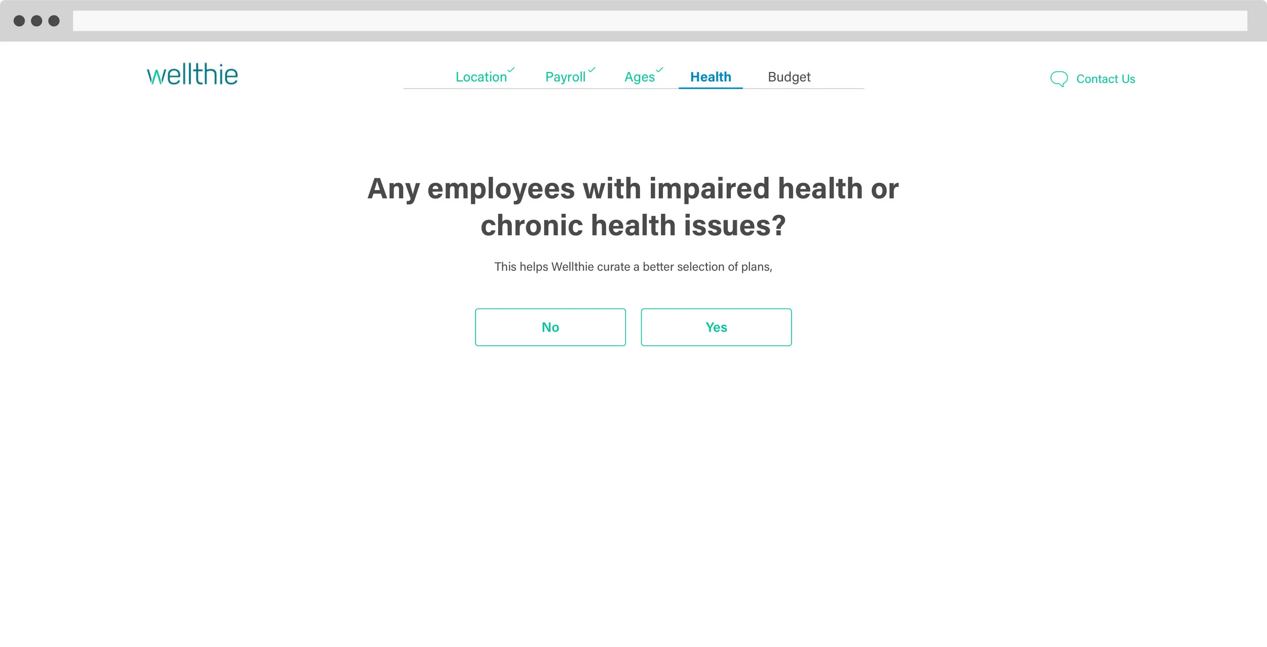
Benefits discovery tool
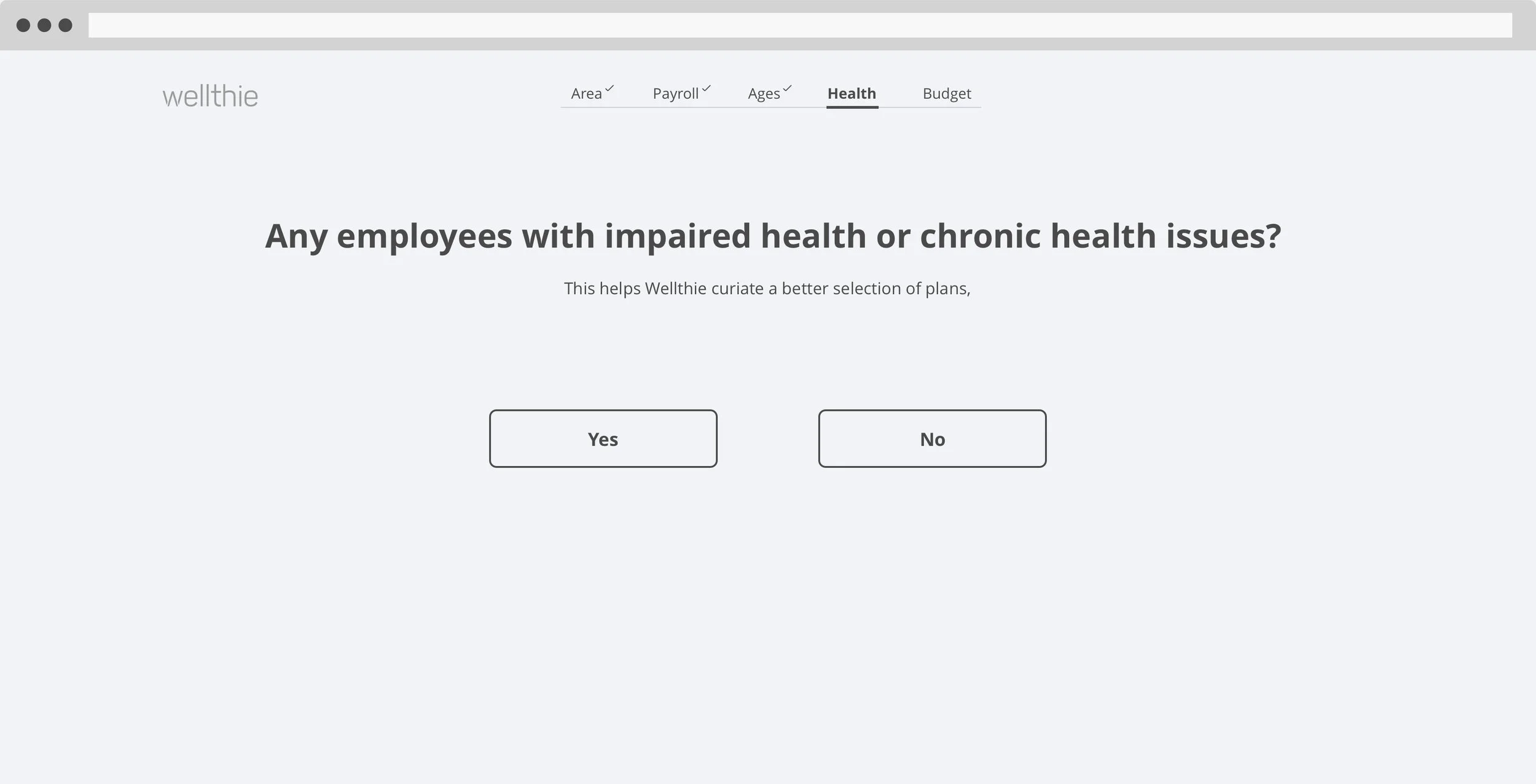
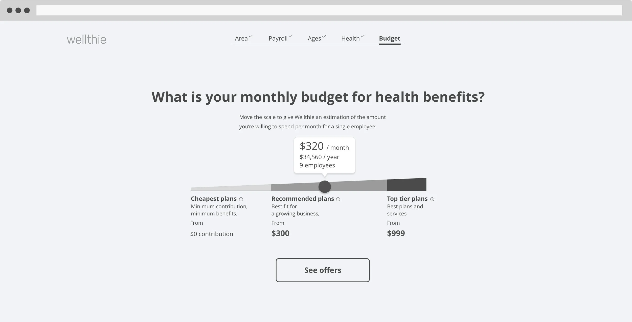
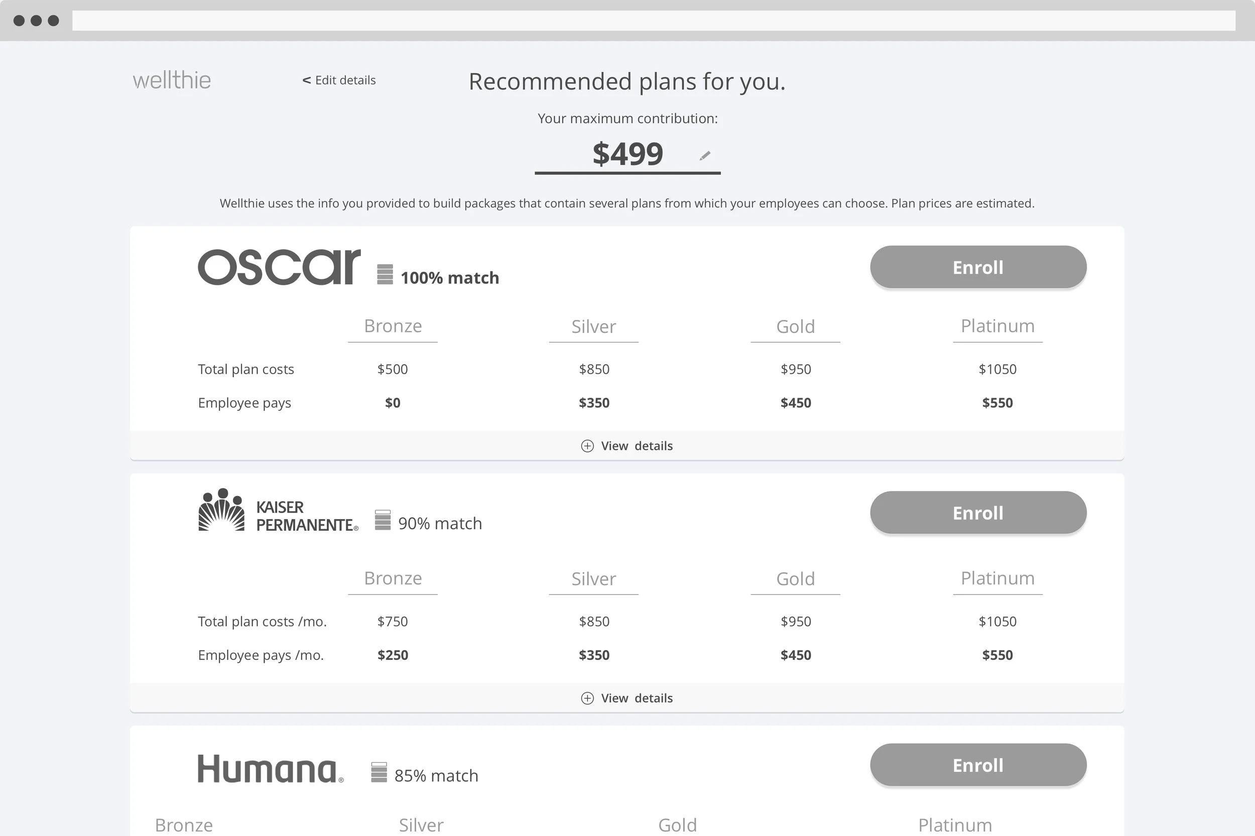
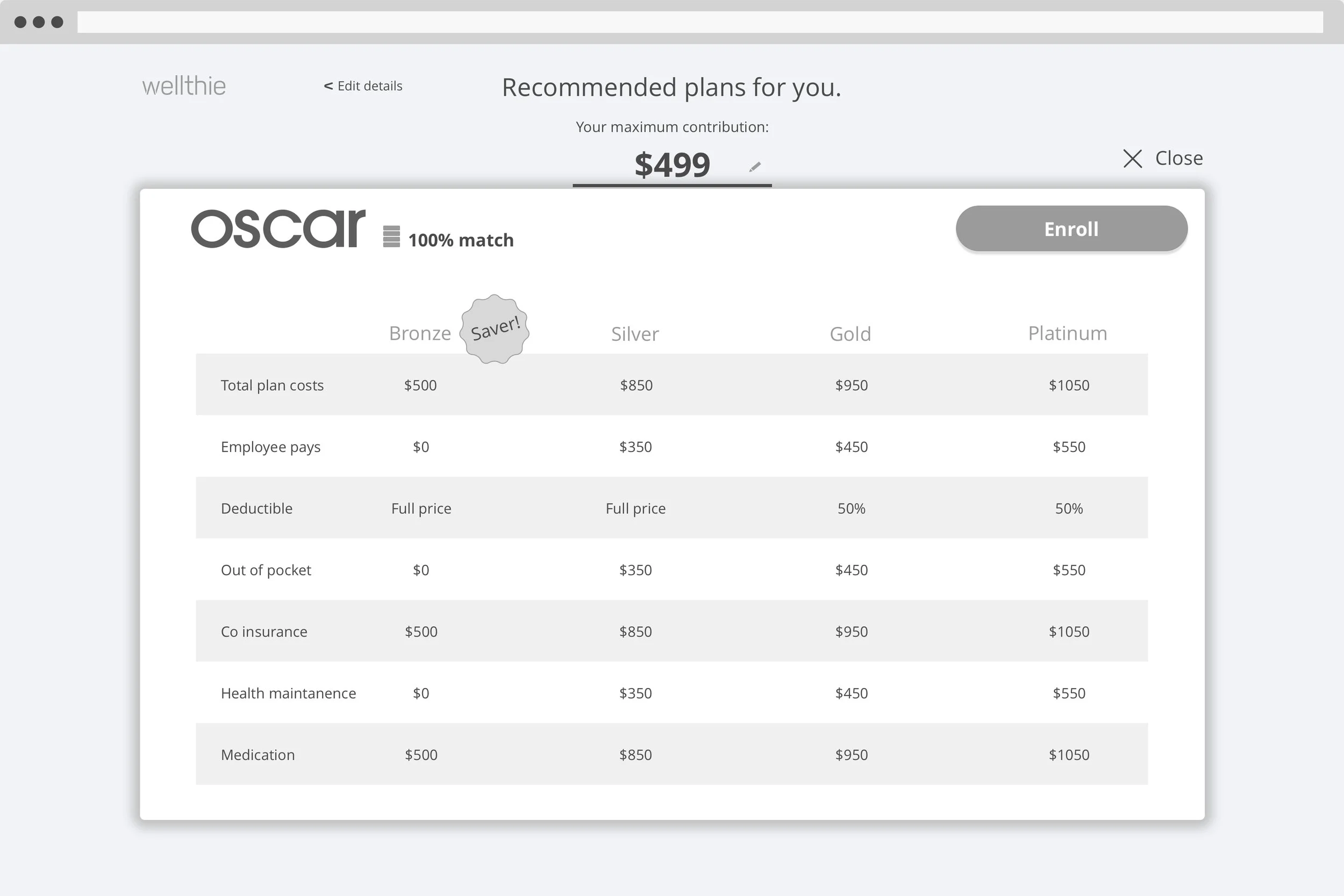
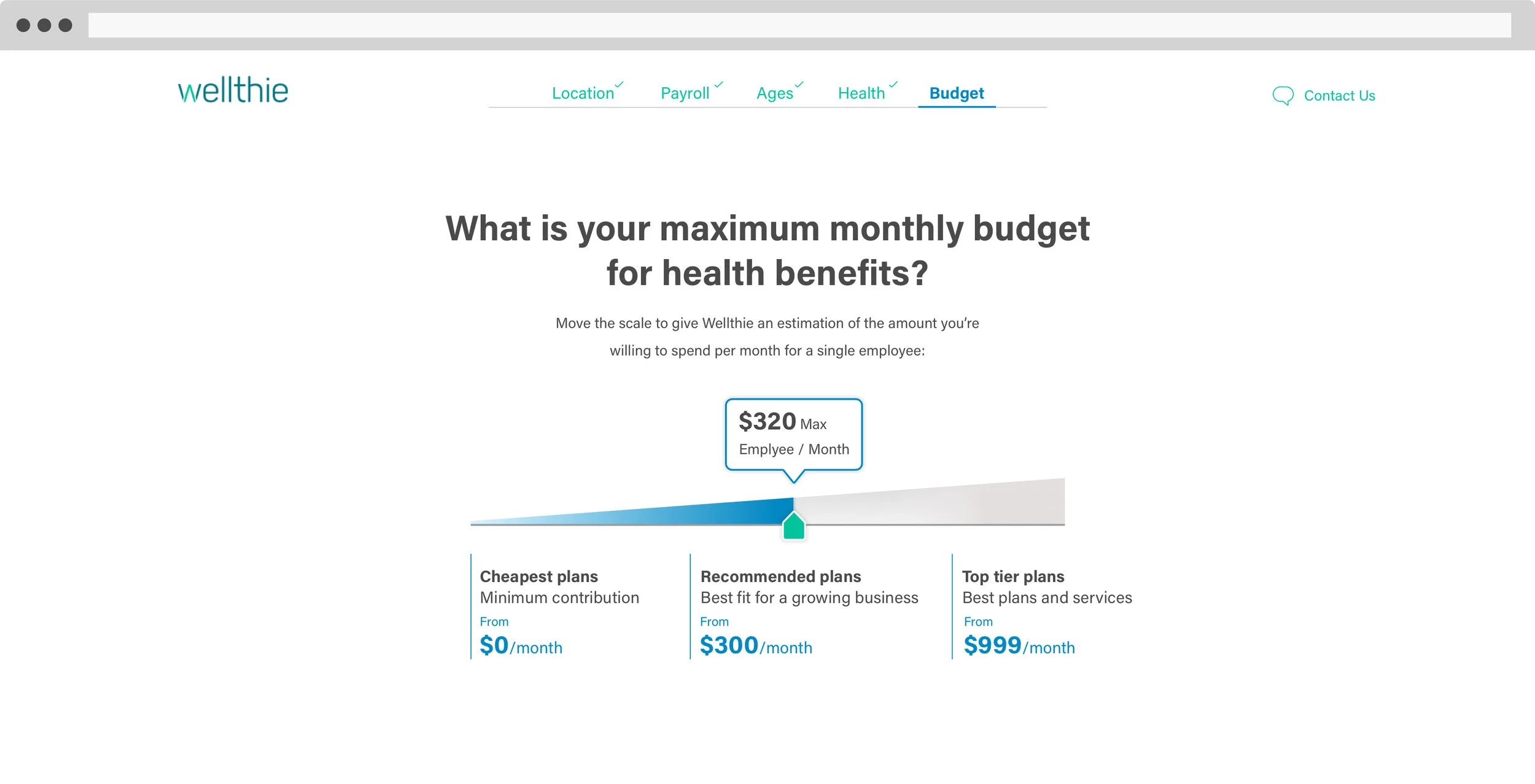
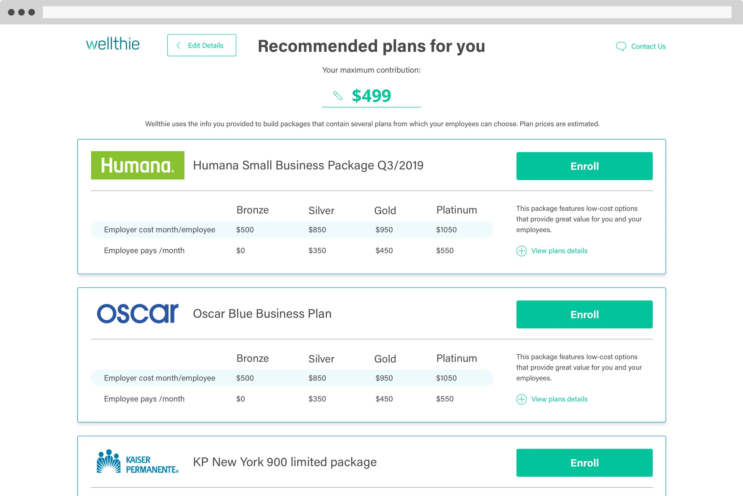
Potential clients enter the benefits discovery tool either through a Google search, ads, or an affiliated broker. They are guided through a brief onboarding flow that includes a questionnaire and a budget estimation tool.
User’s answers create a structured profile that helps:
Curate relevant plans
Support re-engagement
Produce more qualified, “closable” leads for brokers
Each step exists to reduce cognitive overload, uncertainty, and narrow the decision space - to reduce decision paralisys.
After users select preferred packages, they’re matched with a licensed broker to finalize enrollment - with far less time spent on basic education and option overload.
I collaborated with brokers to minimize funnel questions while preserving plan fit and lead quality.
Design iterations and Wireframes
Working incrementally within an Agile framework, the product team began by restructuring the existing tool to support a new workflow. Prioritizing early delivery, we released sections of the product as soon as they were ready—enabling immediate data collection and allowing each sprint’s insights to directly inform the next.
UI and Design system
After testing the flow using interactive prototypes and receiving approval from both employers and brokers, I moved on to refining the visual design language.
The UI draws from Wellthie’s existing logo color scheme and is designed to feel both informative and calming, reinforcing confidence while supporting decision-making.
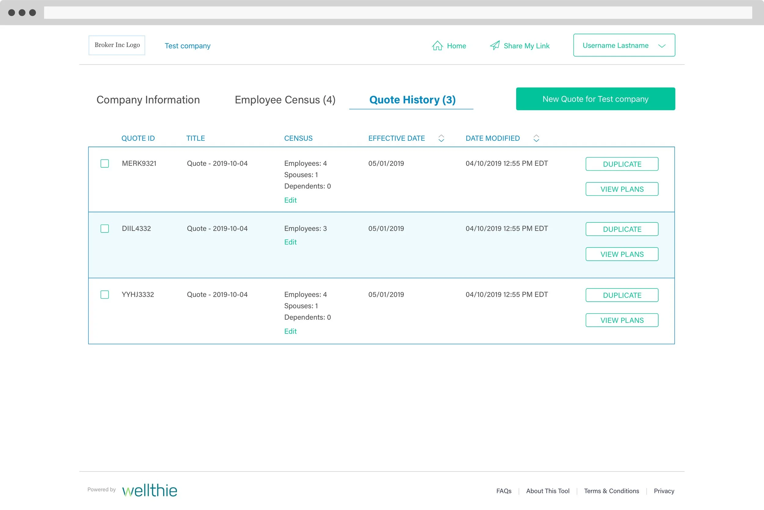
Broker Dashboard
Broker interviews and quantitative analysis revealed that certain flows needed revision, and that some sections were unused, and could be removed entirely.
These changes were aimed at improving usability and reducing users’ cognitive load, streamlining the experience without compromising on clarity or completeness.
I also audited the dashboard, mapping site structure, to pinpoint redundancies and dead-end flows.
My goal with the new architecture was to speed comparisons and reduce time on unqualified leads.
Wellthie broker dashboard structure analysis. The grey boxes describe pages and features that are unused.


Results and lessons
This project stabilized a complex benefits discovery funnel end-to-end, aligning employer onboarding with broker workflows to reduce friction on both sides.
A structured, step-by-step flow lowered cognitive load for employers while producing more focused, higher-quality inputs for brokers.
Quantitative funnel analysis was essential in identifying drop-off points and refining the flow to its shortest effective path.
The work reinforced the value of using structure and measurement to support confident decision-making in high-stakes systems.