MobileODT :
Web app and admin tools
Type: Healthcare / Medical devices
Role: Lead UX/UI
Platform: Web application
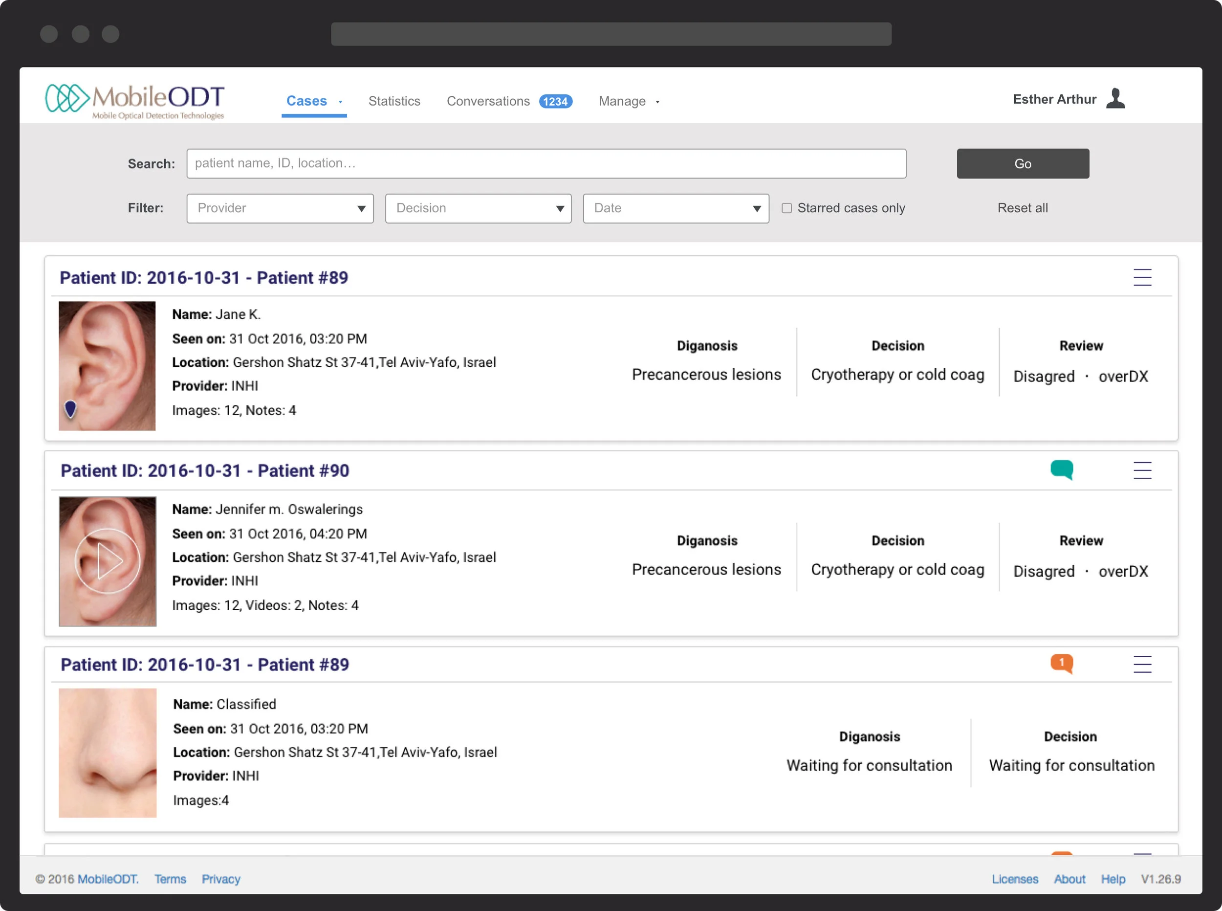
The MobileODT web portal is a toolset for client administrators, supporting user management, data analysis, reporting, and alerts. Administrators can view new cases submitted through the EVA mobile app—as HIPAA-compliant documents with patient identifiers omitted—and add annotations or send messages to the examining nurse in real time.
Admin portal
Users / Personas
User research revealed two key personas for this feature. The primary was the organization administrator—I interviewed several existing clients and used their input to build representative personas, with many also agreeing to beta test the feature. The secondary persona was the customer support team member, who would use the portal to create and manage client profiles as part of their daily workflow.
Personas
User types
Understanding the hierarchy within client organizations was essential for defining user permissions, feature access, and profile types tailored to each role.
Organizational hierarchy and profiles.
The web portal content adapts based on user type. Some profiles can view patient cases they’ve created in the app and provide feedback on others—but not all users have the same level of access. This hierarchy required a permissions system to restrict certain content, particularly personally identifiable data (PID), even within the same organization.
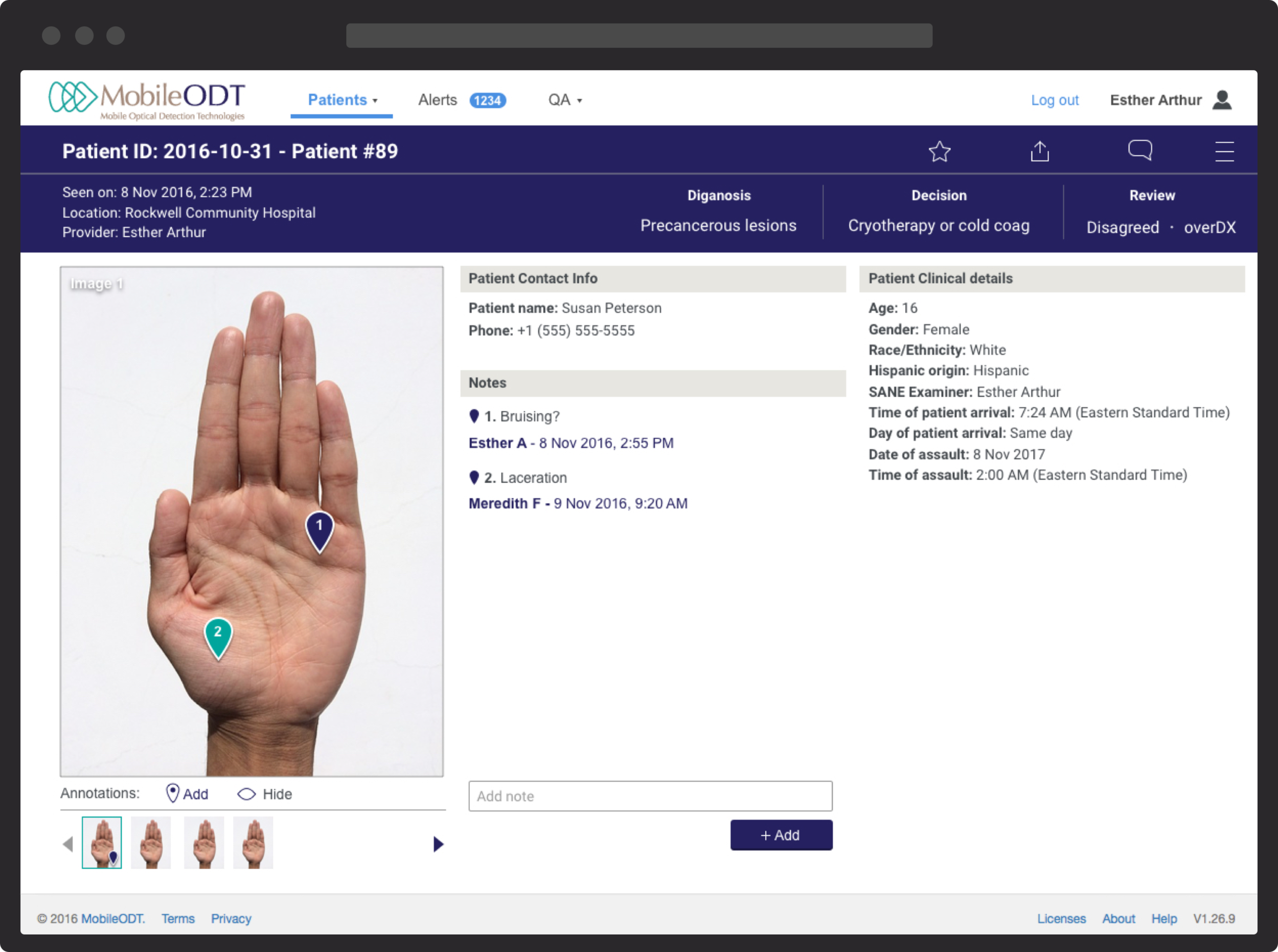
“Profile B”/ own case view - Patient case with annotations
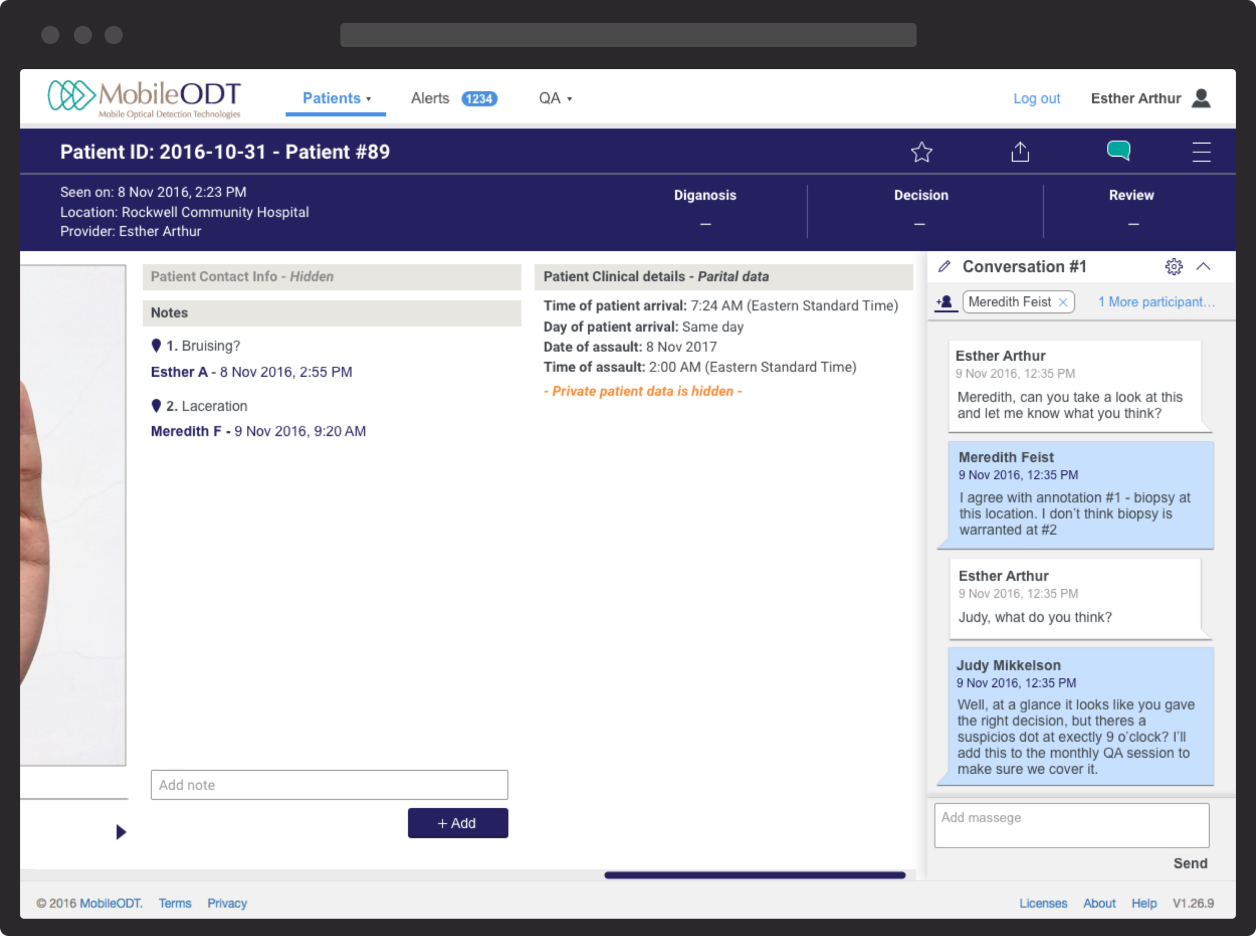
“Profile B”/ other nurse’s case view - Patient case with a conversation
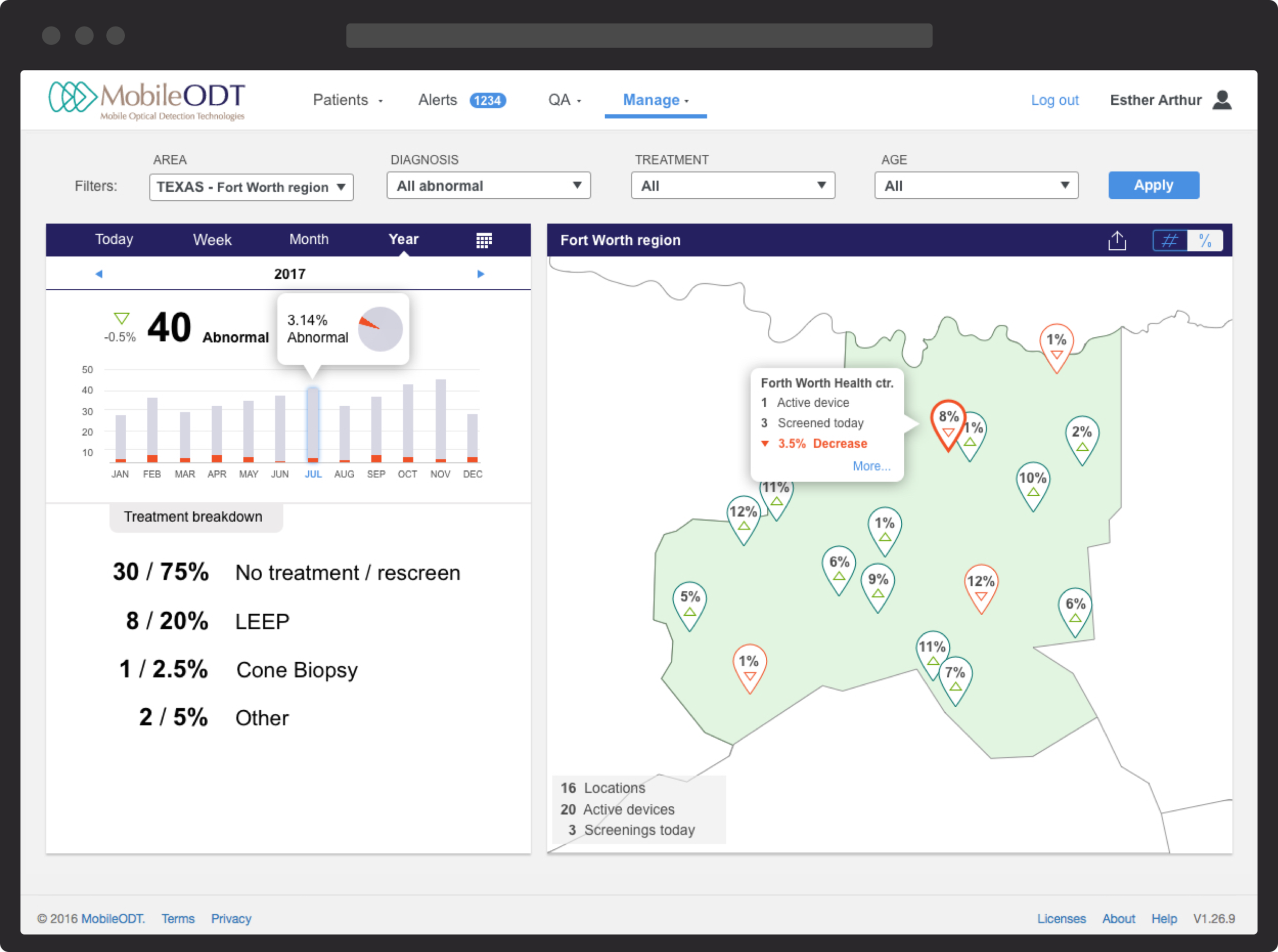
“Profile C” view - Data tracking and reporting
Case study - "Add new user" feature
As MobileODT grew, the company aimed to give clients more autonomy—starting with the ability to create and manage user profiles within their own accounts.
The original profile creation flow had been built by engineers for internal use, without considering client needs. I used this existing process as a starting point for redesign. During the discovery phase, several key usability issues emerged:
The layout and action flow were confusing and unintuitive.
Developer terminology was vague or misleading.
Some features were outdated or irrelevant.
The interface was schematic and raw, never intended for client use, and visually inconsistent with MobileODT’s design language.
The goal of the redesign was to clarify the experience, streamline the workflow, and align the UI with the broader product ecosystem.
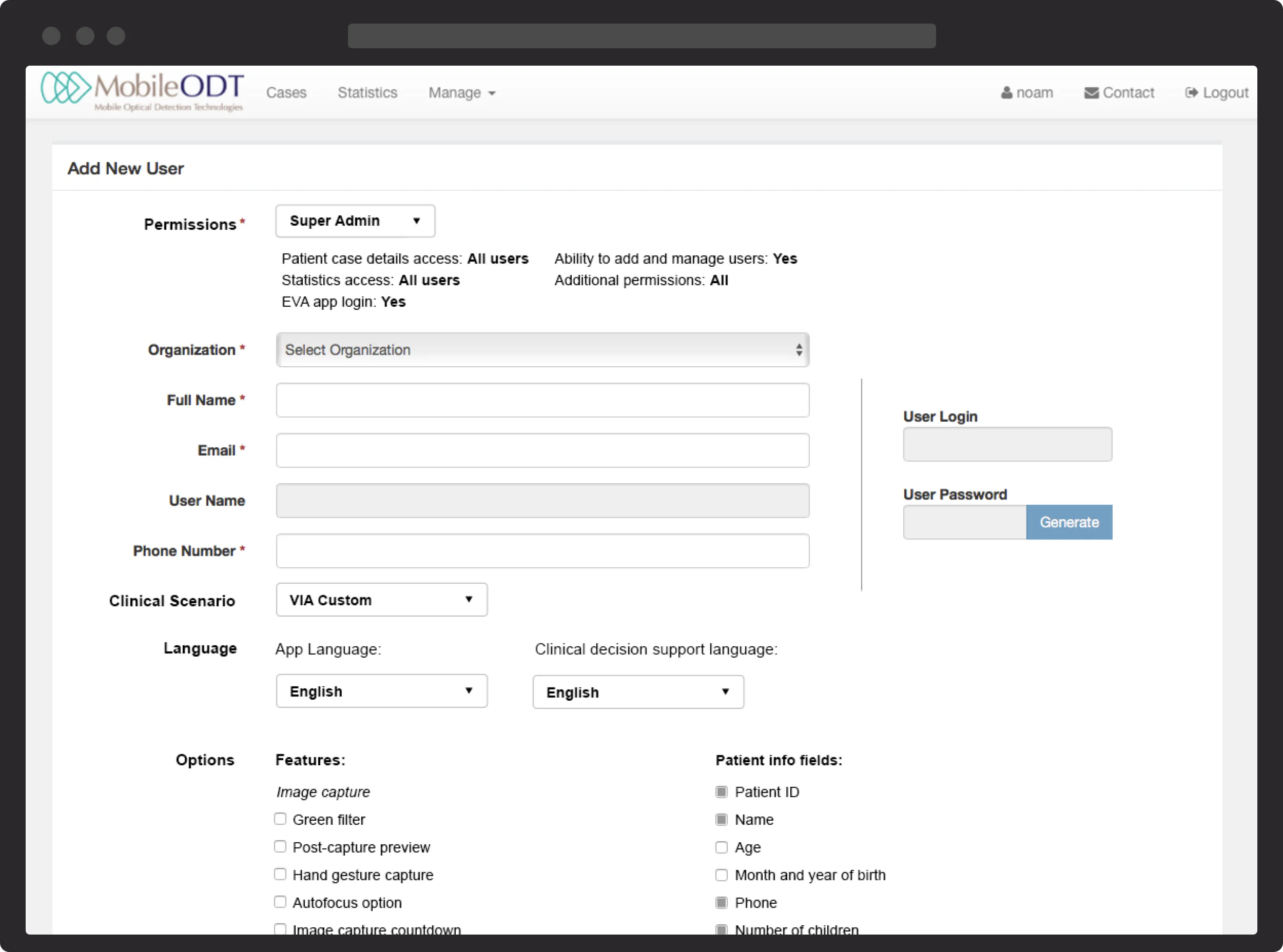
Original UI
Objective
Based on user research and observation, I defined the following goals for the redesigned profile creation flow:
Simplify the process: Creating a profile should be intuitive and self-explanatory.
Support multiple roles: Admins should be able to create various profile types based on organizational roles, and duplicate existing profiles when needed.
Clarify access levels: Data access permissions should be easy to understand and clearly communicated.
Scale across organization sizes: The workflow should accommodate both large, multi-user organizations and single-user accounts.
Enable modular features: The system should allow features to be added or removed based on the client's membership plan.
I started by mapping user hierarchies, then developed wireframes and interactive prototypes. These were tested with users via screen sharing and iteratively refined. Early “profile preset” concepts were later removed in favor of a more flexible final structure.
Prototypes
Permissions
One challenge I focused on was defining profile access permissions. Setting up the permissions wrong could potentially expose sensitive patient information to the wrong user. Originally, the engineers created a permissions presets list that quickly proved unsustainable - it was too long and the definitions were too confusion for external users. Working directly with our users, I iterated on solutions until a I reached small selection with a manageable amount of options. For reassurance, the interface was accompanied by a natural language description of the selected permissions.
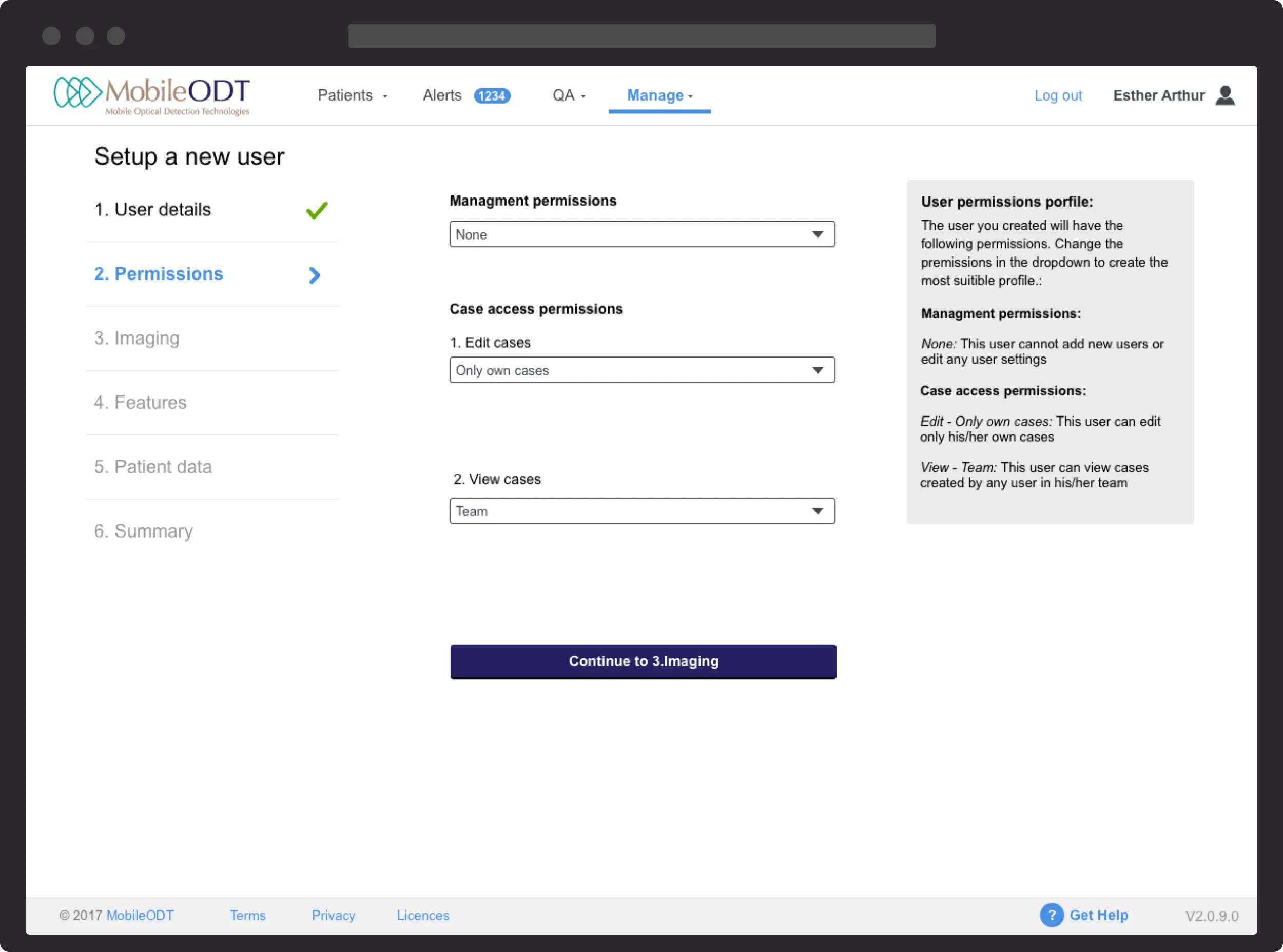
Final permissions layout
Design
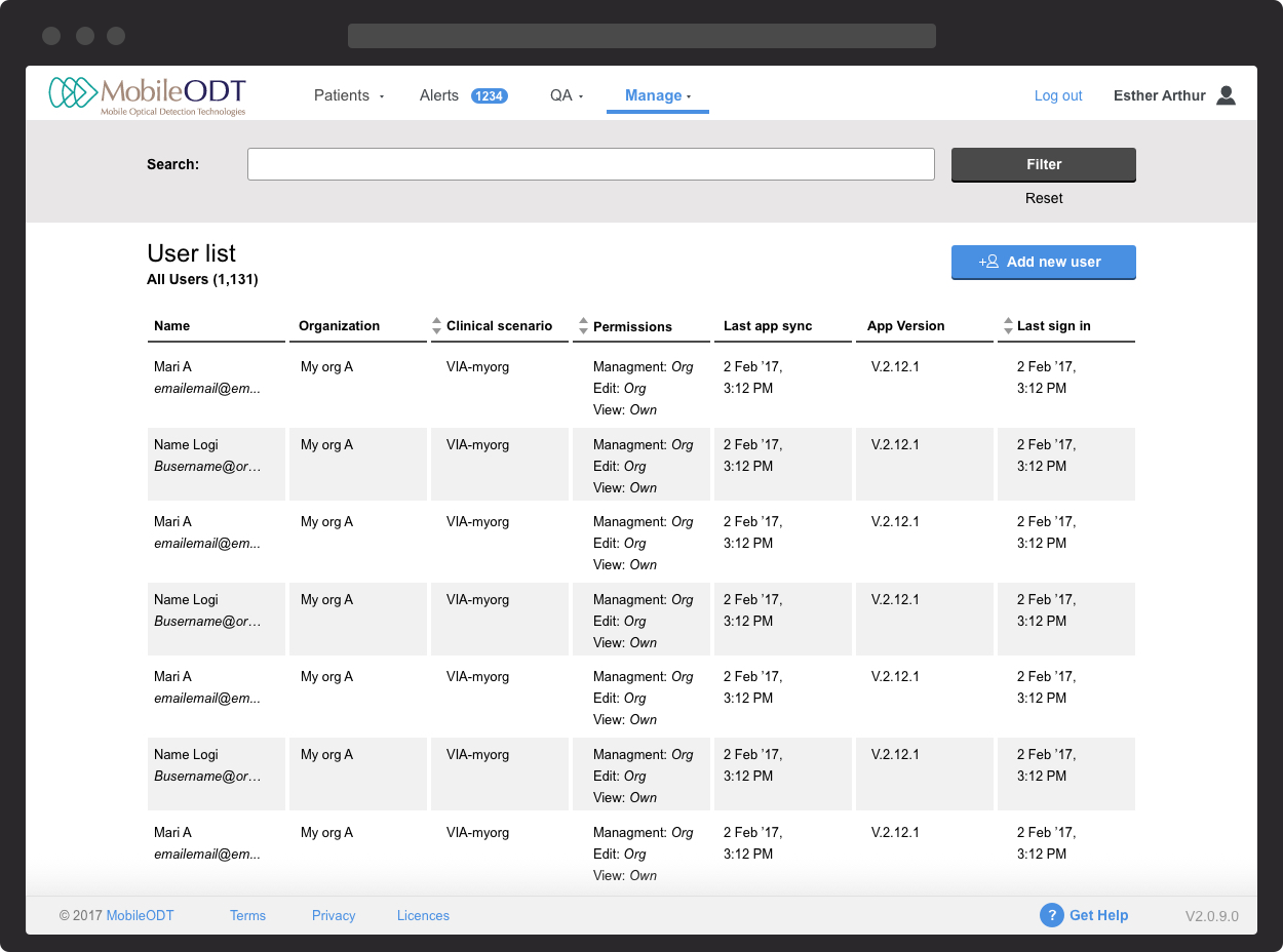
Users list and “Add new user” call to action
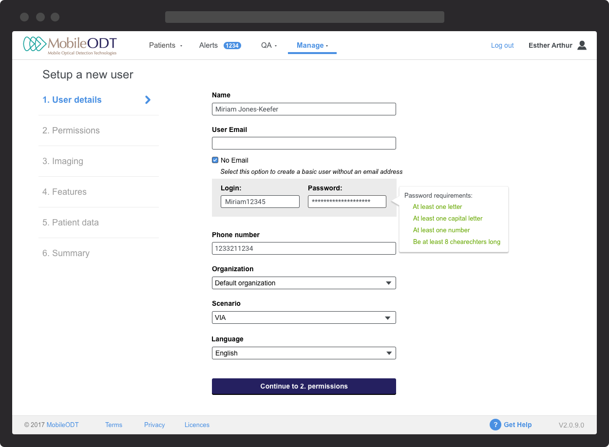
Feature design - new step by step profile setup tool with tooltips, contextual fields and more.
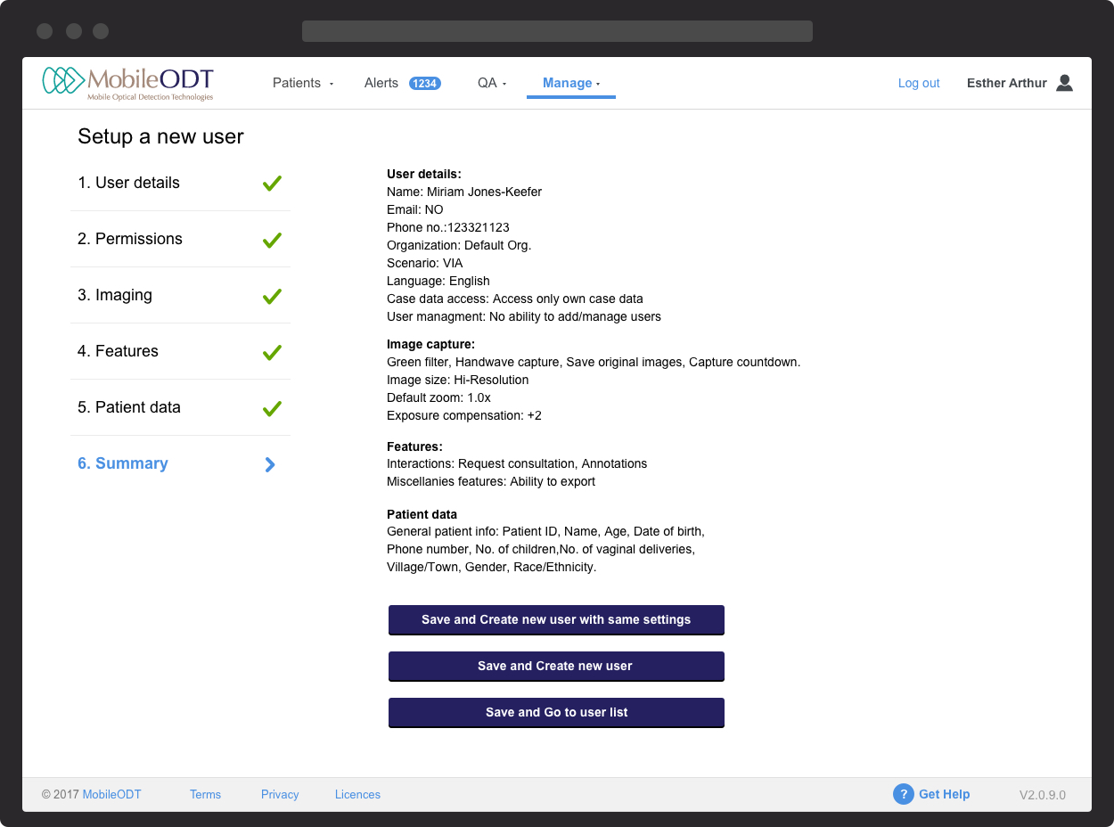
Feature design - The last step of the setup allows for quick duplication of the profile.