Car Comparison Tool
Product: Multi-brand car comparison tool
Role: Strategy, research and UX lead
Scope: iPad app
Created at CI&T
Tool to help sales teams answer competitive customers questions instantly, without losing credibility.
The problem
In the showroom, salespeople are expected to answer detailed, brand-to-brand questions instantly, and often while customers are already well-researched and comparing options in real time. Existing tools failed mostly because they had to pause the sale, mostly delivering the results after the prospect already left.
The problem was not access to information - but speed, clarity, and confidence under pressure.
Research and Users
CI&T was selected to explore a concept for the client’s internal search platform, envisioned as the foundation of a broader sales support ecosystem.
Primary users - were auto salespeople working on the showroom floor, engaging directly with potential buyers.
Secondary users - were sales trainers—responsible for maintaining product knowledge and influencing how information is taught and shared.
On-location interviews were conducted in showrooms to learn better about staff interactions with clients and understand daily challenges, helping me design a solution grounded in their real-world experience.
Usability challenge
To overcome the hurdle of interaction in the middle of another task (sales conversation), the tool needed to identify and competitive advantages instantly, while keeping deeper details accessible without disrupting momentum.
How do we expose depth without slowing the conversation down?
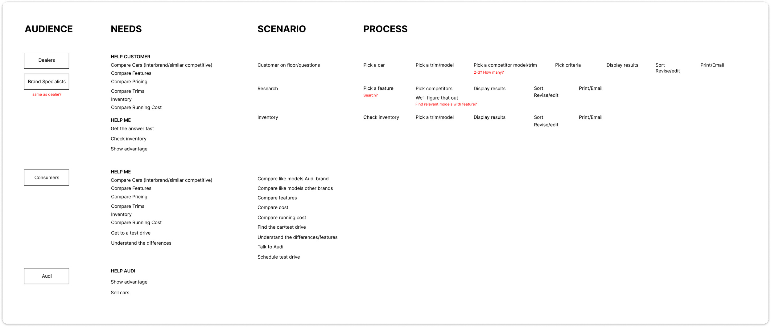
Concept
Since the comparison tool was envisioned as part of a future internal sales hub, the concept was also designed to reflect scalability.
As the core usability challenge was enabling fast, side-by-side comparison across multiple vehicles, we audited several data providers and shaped the information model to support quick scanning first, followed by progressive detail.
Wireframes were used to validate interaction flow, information hierarchy, and speed of access before investing in visual polish.
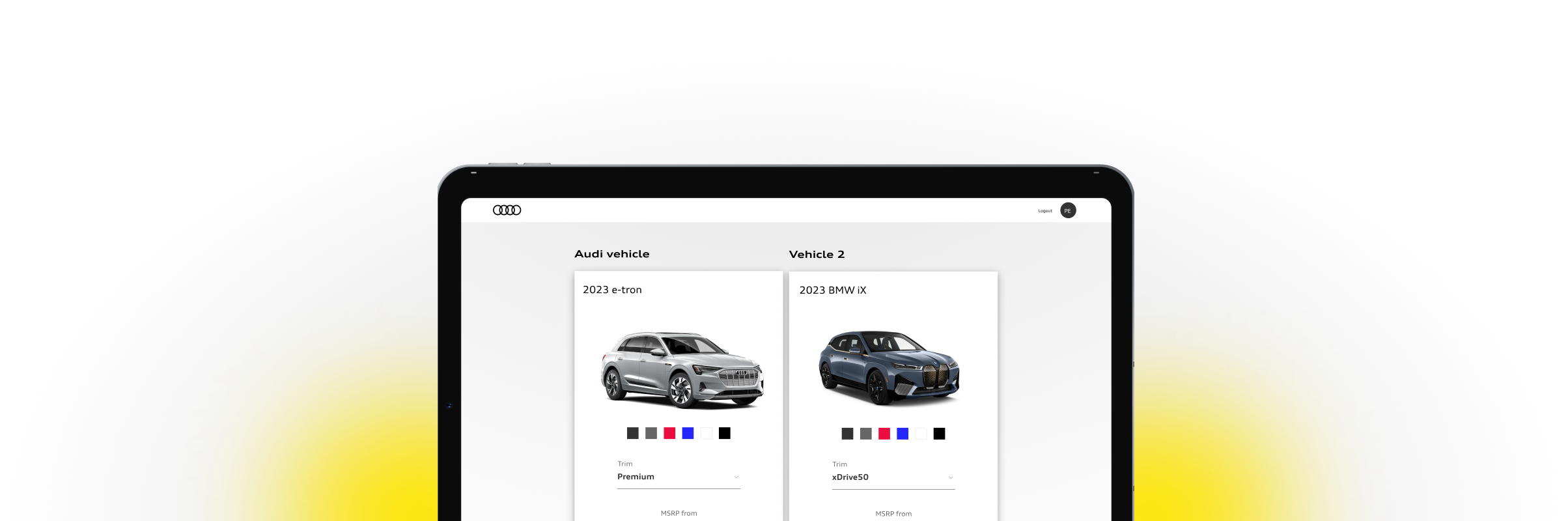
Comparison-first experience

Compare
The comparison solution is robust and gets down to small details. Because of this, the user first lands on a “Key specifications” tab, that enables them to quickly glance where their selection pops against the competition. To give better highlights, advantages for the client’s brand are highlighted.

Search
The search functionality is also important in this case, since client questions tend to specific to a car or a build feature. To make best use and get quick results, search has built in autocomplete and suggestions.

Momentum
To enable the sales rep maintain the lead, the results page offers a “what’s next” section with the ability to share or download the comparison.
Design
Using the client’s established design system, I translated the wireframes into high-fidelity screens, ensuring alignment with brand and usability standards while supporting future scalability.
I also created interactive prototypes, which were essential for testing the solution’s practicality in a controlled environment prior to final approval.
Outcomes
The interactive demo was presented to users and stakeholders successfully
Our interview decisions and reasoning report let to the successful procurement of Auto database services api for the product.
Client’s confidence in scaling the concept into a broader ecosystem - the team proceeded to build and expand this tool for the client.